Do you want to put an end to drabness? Interior design starts with the walls and floors! So take a painting brush, and change your home beyond recognition. You can choose from relaxing pastel tones or extravagant dark colours. Get inspired by our photo gallery of trendy shades.

Most designers agree on two key colours: violet, which is an interior perennial star of the last years, and the untraditionally rich honey yellow.
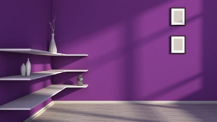
Mysterious violet
The violet colour gives almost a mystic impression. Its dark tone, inspired by a play of lights and shades at dusk, adds nobility and luxury to the interior. It’s still considered unusual when used on the walls, so if you long for surprised and admiring glances, combine a violet paint colour with white and black. Silver or tin housing accessories (picture frames, vases or candlesticks) look amazing on the dark violet background.
Azure blue
We can see the calming blue colour every day, from the azure skies to denim clothes. The comforting blue tone with a tinge of turquoise is excellent for the interior. You’ll create a perfect illusion of a heavenly home by combining fine shades of blue with white decorative elements and furniture made of light wood, such as birch or light beech.
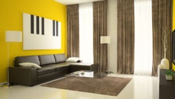
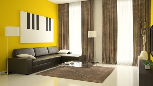
Lemonade yellow
The bold yellow colour will light up your interior at any season of the year. Are you tired of the winter greyness? Do you want to welcome the spring in a new design? Brighten up your apartment with a sweet yellow paint! Then choose furnishings made of dark wood or shiny leather. Grey elements, metal housing accessories and white textiles can add some sobriety to the yellow room.
Neutral grey
Grey is a basic colour which will never lose its attraction. Its cooler, darker shade looks great with earthy brown in the interiors. To achieve a perfect equilibrium between the traditional and modern design, combine cool and warm colours. If you need to make your room brighter, choose white decorations; if you want to make it darker, use dark, rustic furniture made of ebony wood.
No gloss! Matte colours are in fashion!
This year, the producers have bet mainly on matte colour shades. They look soft and warmer in the interior and intensify the hospitability and cosiness of your home. Shiny colours, on the other hand, radiate severity and coldness. Even the blue and violet colours seem to get warmer in the matte shades. Thanks to soft tinges of red and yellow, you don’t have to be scared of them anymore. Matte colours combine well with intense metallic shades and distinctive accessories.
Photo – source: Pixabay.com, Dreamstime.com